Professional Presentation Clock Setup: Stylish Time Screen for Meetings
In today’s fast-paced business environment, keeping meetings on track is essential for productivity. However, many professionals struggle with tiny, hard-to-read time displays hidden in the corner of presentation software. Have you ever lost track of time because your laptop clock was too small to see? This common issue can lead to rushed conclusions or meetings that run over schedule, frustrating both speakers and attendees.
This guide will show you how a professional time screen can transform any device into a clear, elegant time display. By using our minimalist time screen tool, you can command attention during meetings, whether you are in a corporate boardroom or a virtual classroom. Our tool is designed to be simple, stylish, and always accurate.
Before we dive into the technical details, you can test our customizable clock tool to see how it looks on your current screen. Using a dedicated clock allows you to focus on your delivery rather than squinting at your taskbar.
Choosing the Right Clock Theme for Professional Settings
When you are presenting to a group, the visual style of your clock matters just as much as your slides. A clock that is too flashy might distract your audience, while one that is too subtle might be ignored. Choosing the right presentation clock theme is the first step toward a more organized meeting.
Minimalist vs. Bold: Matching Clock Styles to Your Brand
Our platform offers various themes ranging from "Digital" and "Flip" to unique "Manga" styles. For professional settings, a minimalist theme is often the best choice. A clean, high-contrast digital display ensures that everyone in the room can read the time at a glance. This prevents distractions caused by unnecessary animations or cluttered interfaces.
On the other hand, if you are presenting at a creative agency or a startup, a "Bold" or "Flip Clock" theme might better match your brand identity. The goal is to make the clock look like a deliberate part of your environment rather than an afterthought. You can explore these styles by using our elegant full-screen clock today.
Digital vs. Analog: Which Clock Format Works Best for Presentations?
The debate between digital and analog clocks usually comes down to "cognitive load." Digital clocks provide an instant, exact reading of the time. This is perfect for high-stakes presentations where every minute counts. Most users find that a digital full screen clock is the most efficient way to stay on schedule.
Analog clocks provide a better sense of "duration." They allow the presenter to visualize how much of the hour has passed. If your presentation is more relaxed or focused on a long-form workshop, an analog style can feel more traditional and less urgent.
Technical Setup for Different Presentation Scenarios
Setting up a clock is not a one-size-fits-all process. Depending on whether you are speaking in person or online, your technical requirements will change. Understanding how to manage your meeting clock setup will help you avoid technical glitches in front of your audience.
Projector Setup: Ensuring Clock Visibility in Large Meeting Rooms
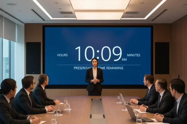
When using a projector, the most important factor is size. A clock that looks large on a 14-inch laptop will look tiny when projected onto a wall in a 50-person conference room. To solve this, always use the "Full Screen" mode available on our homepage.
Simply visit the site, click the full-screen icon at the bottom, and your browser will hide all tabs and menus. This creates a dedicated time screen that fills the entire wall. Remember that projectors often wash out light colors. Using a "Dark Mode" theme with bright white or yellow text is usually the most readable option for large rooms.
Virtual Meetings: Integrating the Clock with Video Platforms
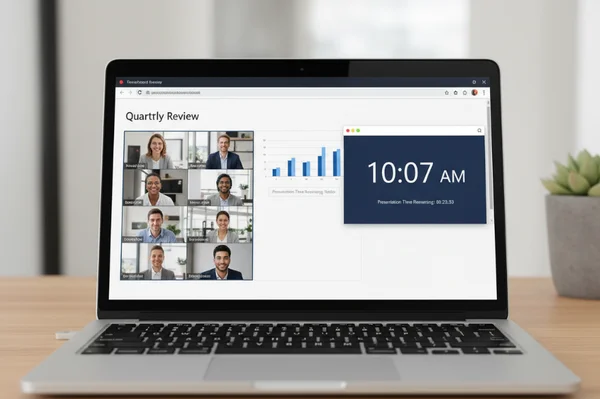
In virtual meetings on platforms like Zoom, Microsoft Teams, or Google Meet, you can share your clock in two ways. The first is to share your entire screen, but this can sometimes reveal private notifications.
A more professional approach is to open our tool in a separate browser window and use the "Share Window" feature in your meeting software. This allows you to place the clock side-by-side with your presentation slides. Your participants will appreciate having a visible reference for the time. This helps keep the Q&A session from running long. You can start your setup now to test how it looks in your preferred meeting app.
Dual Monitor Configuration: Pacing Assistant vs. Shared Screen
If you have two monitors, you have the ultimate setup. You can keep your presentation slides on the main screen and place a customizable clock on your second monitor.
This setup allows you to monitor the time privately without the audience ever seeing the clock. It acts as your personal "pacing assistant." If you notice you are falling behind, you can speed up your delivery without having to check your watch or phone. This maintains a professional appearance throughout the session.
Advanced Customization for Professional Environments
A professional tool should adapt to your needs, not the other way around. Our platform allows for deep customization so that your clock fits perfectly into your corporate environment.
Creating Corporate-Color Clocks to Match Your Brand Identity
Brand consistency is a sign of professionalism. While we offer several pre-set themes, you can use our settings menu to adjust the look of your display. By matching the clock’s color scheme to your company’s brand colors, you create a cohesive visual experience.
When you enter the "Settings" menu, you can toggle various display options. One key feature of our site is that all your preferences are stored locally in your browser. This means your corporate settings will be remembered the next time you visit. Just make sure to click the "Save Changes" button to lock in your professional look.
Optimizing Font Sizes for Viewing Distance
Not all screens are created equal. A clock displayed on an iPad at the back of a room needs to be much larger than a clock on a laptop sitting right in front of you.
Our tool automatically scales the time to fit your window size. If you need the time to be larger, simply increase your browser's zoom level or expand the window. This flexibility makes it the perfect large screen clock for any venue, from small huddle rooms to grand ballrooms.
Date and Time Format Best Practices for International Audiences
Presenting globally? Time formats vary widely. Use our tool's quick toggle between 12-hour and 24-hour modes. This avoids confusion for international teams.
In the United States, the 12-hour clock (AM/PM) is standard. However, in many parts of Europe and Asia, the 24-hour clock is preferred. For international meetings, using the 24-hour format can reduce confusion. Additionally, you can choose to hide or show the date and seconds. For a clean look, we recommend hiding the seconds to prevent constant movement from drawing eyes away from your content.
Troubleshooting and FAQs
Even with the best tools, issues can arise. Knowing how to troubleshoot quickly will keep your presentation moving smoothly.
Fixing Visibility Problems and Glare
Sunlit conference rooms often wash out screens. Fix this instantly: choose high-contrast themes. Black backgrounds with bright white text cut through glare beautifully. Perfect for glass-walled conference rooms battling glare, a high-visibility clock is the most reliable way to remain on schedule. Avoid using "soft" colors like light gray or pastel blue in these environments.
Solving Clock Synchronization Issues Across Multiple Devices
In some cases, you might have multiple people presenting from different locations. If everyone is using their own computer clock, there might be a discrepancy of a few seconds. This can make transitions between speakers awkward.
Because our tool pulls time from your local system but provides a unified interface, you should encourage all presenters to sync their system clocks with internet time (NTP). This ensures that everyone is looking at the exact same realtime clock, keeping the entire event perfectly synchronized.
Appendix: FAQs About Presentation Clocks
What size clock should I use for a 50-person conference room?
For a room of this size, your clock should occupy at least 25% of the screen if shared alongside slides. Alternatively, display it in full screen mode on a dedicated monitor. The digits should be at least 10 inches tall when projected so the back row can read them clearly. You can test the scale on your projector before the meeting starts.
Can I use this time screen for paid commercial presentations?
Yes, absolutely. Our tool is free for both personal and professional use. Many corporate trainers and keynote speakers use our time screen to manage their sessions. We prioritize your privacy by storing all settings locally. No personal data or presentation details are ever sent to our servers.
How do I ensure the clock doesn't distract from my presentation content?
To minimize distraction, choose a minimalist theme and hide the seconds. The ticking or changing of seconds can create a sense of anxiety. It can also draw the eye away from the speaker. By showing only the hours and minutes, you provide the necessary information without the visual noise.
What's the best clock theme for medical or healthcare presentations?
In medical or healthcare settings, clarity and precision are vital. We recommend the "LED" or "Digital" themes. These styles mimic the look of medical equipment and are very easy to read under bright, fluorescent lighting. Explore our hospital-approved LED theme—ideal for medical settings—right on the homepage under the themes menu.
Want to keep meetings sharp and focused? A large, sleek clock screen makes it effortless. By moving away from small, cluttered taskbar clocks and adopting a dedicated time screen, you provide clarity for yourself and your audience. Don't let another meeting run over time. Transform your next presentation by using our minimalist time screen tool and setting up your perfect display today.